Monday, October 15, 2012

Magazine Monday - Horse Frame

Welcome to Monday!
I'm just back from a 4-day writers conference in Eureka Springs AR. I look forward to this weekend every Oct. Unfortunately, Abby's birthday will almost always fall the same time and I won't get to go as often - breaking a 19-year attendance streak. But my Cupcake and Tootsie pop (Adrian) will always come first.

I spent part of World Cardmaking Day working on supplies from swap envelopes. I belong to a group on SCS. Each month we take a turn at sending out an envelope of goodies to everyone else on the list. We combine the components of the envelope with our own stash to see how many cards we can make. Sadly, I am WAYYYY behind (like 2 years worth!) of getting cards made. I decided to start with my most recent envelope and work my way backwards. Well, except Sept. envelope should have been from Amy and I couldn't find where I had put it when I carried it in from the mail box. All the other envelopes were filed where they were suppose to be so I started with August - from my friend Shell.

Shell and her daughter, Jaydin, are becoming quite adept at horse riding. Jaydin is a natural and loves horses. So Shell kept to a horse theme and sent us lots of goodies to play with. I came up with six cards from her envelope... one of which I'm showing off today.


Shell sent the twine, the brad (Spare Parts) and the green embossed background. I ran a piece of SU Chocolate Chip through my Paper Studios EB to mat the horse oval. I used Derwent WC pencils to color in the horse (Clear $ Stamps - Just Horsin' Around) . I think of it as a remembrance tribute to a faithful friend.

This card also applied to the SCS Sketch Challenge SC48

Wednesday, October 10, 2012

Recycle Wednesday - Needle Book

Okay, this isn't necessarily a recycle project as it is a repurposing.

I love to sew. I don't know a lot about some things as much as I should. One of those is the proper sewing machine needle to use for specific fabrics. The other thing is I have a needles for different fabrics but they're all kept in one ziploc bag. While watching Fons and Porter's Love of Quilting, I saw a tips segment where a gal kept her needles in separate jewelry bags and then all of the bags in a plastic hard case index card holder.
Not bad... at least they're not all piled together to be sifted through like a deck of cards.

Then last year while in Paducah KY I found an issue of Simply Homemade - a crafting magazine from the UK. I love their magazine because you always get more than just a magazine. This issue came with the cutest set of stamps from NitWit Collections. They also had a beautiful collection of papers and cut-out embellishments from their Thimbles and Threads line.

So this is what I started with:

If you look in the right of the brag book, you'll see a glimpse of the project they had in the magazine made from a chip board album. I needed pockets to put my needles in so I picked up a generic brag book for $1 at Dollar General. I'll use the first couple of pages to put a chart showing which needle # works best for which fabrics. Then the rest of the photo pockets will hold the different needle sizes. I also plan, once the needles are in place, to use scraps from the papers to label the pages with the coordinating needle size so I can put them back in the right spot when I am finished with them.

I didn't use the clear stamps you see in the bottom left corner - just the papers/ cut-outs they provided.
I photocopied some of the cut-outs to white CS so they'd be a bit stronger and I'd retain my originals for now.

Here's what I came up with:

The tape measure, the mouse, the base paper and the mat are all from the magazine packet. I added the buttons and stamped NEEDLES using Hampton ART stamps. The sewing machine is from Jesse James Buttons.

Now to get the needles put away. :-)


Tuesday, October 9, 2012

Magazine Monday - Happy First Birthday, Cupcake!

Yep, it's been one of those weeks already. And still so much to do before Thursday.

Today's card was inspired by Jen del Muro. I didn't realize until I searched for Jen's website that she is one of my favorite people at SCS. You can see Jen's gallery of creativity HERE. I always think girly-girl when I see Jen's cards, though they aren't necessarily all pink and frills. Maybe it's her smile.  

In the Summer 2009 issue of Paper Creations Magazine, Jen showed us the Inner Princess. She used several shades of pink CS, paired with dotted patterned paper and scalloped edges to make an adorable 'princess'  card any little girly girl would love to receive for her birthday. The sentiment, from Elzybells Art Stamps (closed in 2010 but may be found on eBay) proudly encourages to 'celebrate your inner princess'.  I kept pretty much everything about Jen's layout the same. She did use a ribbon and bow on the bottom rectangle (below the circle) and 3 pink baubles to the bottom right corner. Since this card is going to my Granddaughter, Abigail, I chose to leave those things off and keep it simple. She turns ONE on the 13th and we know how they like to rip into things then put the pieces in their mouth.


I've always called her my little cupcake. So I chose the cupcake stamp from Studio G. The sentiment is actually part of a 3-stamp wedding set I bought at $Tree several years a go. But any birthday is a BIG DAY for a child.  The cupcake and sentiment are stamped in SU Chocolate Chip. Then I colored in the cupcake swirl with a Brown perma marker and the cherry with Red. For the cupcake liner, I used a Pastel Pink.

The papers and the 'ribbon' trim are from SU - DP Ice Cream Parlor and the CS is ValuCS - Garden
collection. The .card will be a couple days late for her birthday, but then so will Grandpa and I

Thursday, October 4, 2012

Gelato Technique


I’m finally getting some time to play with the Gelatos and show them off.
These particular Gelatos are from Faber-Castell. FC makes a wide array of products… everything from a basic #2 pencil to expensive pens. But when it comes to their art product, like SU, they make them to work together. Whether you’re working with their colored pencils, makers or Gelatos, you can go back and forth from one to the other. However, FC is more of an ‘artist’ quality. Think the difference between Copic and Marvey markers. Gelatos have a very creamy texture, allowing them to keep their intensity.

You may purchase Gelatos in a variety of ways… by the entire color set, which includes glittery tones, as a 2pk coordinating (comes with a clear stamp so you can play right away!) or as a set with a matching pencil and marker combination. I first found the 2 packs at HL and Michaels. Of course, I now have all of them except the glitter tones. I was thrilled to find the complete set of all their colors at the stamp show in August, but couldn’t justify buying the entire set (around $60) just to get the 5 or 6 colors I don’t have. I’ll have to purchase those separately later.

As opposed to an actual project this time around, I chose to show the difference in ‘watercolor’ mediums… Derwent WC pencils, Gelatos, SU WC crayons.


Working with any of the three is very simple, but you will get different grades of effect from each. I've drawn three ovals on a sheet of paper pre-coated with white Gesso. You may skip the Gesso step by using a watercolor paper. I just have a stack of this paper I need to use so it's my 'test' paper. I'll use the ovals in future art journals. I kept to BLUE as it was the most easily matched between the three mediums.

The first one, I started with the Derwent WC pencil. I colored the entire oval in lightly, then went back over it with the water brush. You can see how the intensity changes by adding the liquid.

WC pencil
Completely filled in

With the pencil you get a nice tone but it's also 'watery'. If you tone down the water, you don't get the intensity. It's a trade-off depending on what you're after

Next I used the SU WC crayons. I believe it is Brilliant Blue
blended techniques
I went 2 different ways. As you can see the bottom part of the circle is darker. I created the darker tone by coloring directly to the paper the same way I did with the pencils. The top is a bit lighter - created by brushing the water brush across the crayon then applying it to the paper, pallet style.

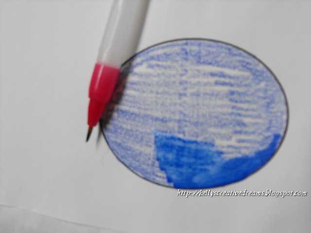
And finally, the Gelato.  This is my favorite because of the creaminess. They don't lose their intensity with the water. 
Gelato


I used the same technique for the Gelato as I did the crayon. The bottom have is direct-to-paper while the top half is brush-to-stick. Notice the difference in the intensity between this and the crayon. Crayons consist of wax - wax and water don't mix. Whereas, Gelatos are a creamy paste and blend well without getting 'washed out'. If I'd played with this a bit more you would be able to see a shading/ blending from the the dark to the light as being almost seemless. Picture using this in reverse as a sky reflected in the water kind of thing.

One of the best YouTubes I've found is by thefrugalcrafter. This gal is just awesome. I love a lot of her techniques in the stamping/ art field. In this particular link, I think I liked the background better before she blended it around. But what an awesome addition to using your EB folders on solid CS. She also shows how to make your own Washi tape using masking tape and Gelatos.

As I put projects together with my Gelatos, I'll show them.
Creative Blessings!
~Kelly


Wednesday, October 3, 2012

Recycle Wednesday - Cardboard?

Yep, Cardboard.  So much of this stuff winds up in landfills every day, even with the number of recycle centers available nationwide. Some people either don't think, don't have time, or don't care. All three are sad excuses in my opinion. My (step) mom aka Grammy, taught me out to make useful things from stuff most people would throw away. At the time I thought it was fun. I didn't know it was out of necessity.

So when it came time to figure out the best way to store my fibers, I found big 'bobbin' cards from Cropper Hopper. Well, cool as they might be I did not have the money to package up my MASSIVE amount of yarn, ribbon, thread. You'll get an idea in a minute.

I also wanted to get a handle on it BEFORE we moved. Being pre-carded, it would be easier to pack for the move. One thing I had a lot of was cardboard. You don't want to use just any cardboard. It needs to be the corrugated boxes like grocery products are shipped in. You don't want it bending as you wrap. It's easy to 'wrap tight' without even trying on more flimsy cardboard.


Each board is about 3" x 5". The one on the right is notched for ribbon and the one on the left, for fiber's such as yarn and embroidery floss.  For the real wide wired Christmas ribbon I use the same card except I only use one notch on either of the long ends... ie only one ribbon per card.

Now.. why did I need an organizations system like this?

This is one of 3 15" x 15" drawers in my storage cabinet jam packed full of the cards and filed by color. The drawers do NOT include season-specific ribbons. For those I try to leave them on their spools in themed sterilite containers. However, Christmas ribbon has a tub all it's own - separate from the Christmas embellishments. 

Let's just say, I've saved A LOT of cardboard. :-D

Creative Blessings!

Tuesday, October 2, 2012

Tea Pot Tuesday

I'm doing really well at getting in here in the evening. I promise, tomorrow's post will run earlier. hehe

Normally I know what I want to do when I start a card... and it ends up very close to my original plan. Today's card fell WAY off the mark. Partly because I had seen a sketch yesterday and knew it would be perfect. Do you think I could remember where I saw it today? NO!  So I tried winging it. That didn't work either.

So instead my card for Jean Linabury in Malabar FL is simple, while including the elements given in the challenge - to bring a Yellow Cat or at least the color yellow, and scripture. Jean has terminal lung and breast cancer. Seems like that horrid monster rears it's ugly head more and more as we progress. So sad. Jean loves the color yellow and is strong in her faith. Her son John, has epilepsy and is unable to travel to FL to see his mom. So our we are showering her with love and support in his stead.

The cat shows up better in person. I used scraps of ValuCardstock yellow. The cat is from Paper Crafts Inspirations Magazine inclusion sheet, stamped in SU Sunshine Yellow (ret.) The sentiment is from SU Thoughts and Prayers. The base is SU Concord Crush (ret). All the embellishments are from my massive amount of stash. I used Cricut Accent Essentials cart. to cut the labels. I cut one the same size as the cat's mat but trimmed it down to fit the sentiment.

Monday, October 1, 2012

Magazine Monday - Circles & Scraps

Happy Monday Y'all!

Yes, I'm a bit late. Instead of playing with paper and ink yesterday, I scrubbed my kitchen floor and washed all the rugs. Glamorous life we lead, isn't it. ::: smile ::: But my floor looks awesome.So today is my usual Monday business AND squeezing in some play time.

Today's inspiration card is by designer Charlene Austin. If you click on her name, it will take you to her blog. If you click on this - Paper Creations, it will take you to a profile they did when they featured her as a guest artist. To top it off, if you click on Splitcoast - it will take you to her gallery where you can see tons of her creativity in one place. Pretty neat gal!

Charlene's card was a Birthday card with a bright turquoise bow from Creative Impressions. She used 5 rows of 5 circles on her card. I had mine going a bit closer together and wound up with 6 circles and only 4 rows.

A dear friend of mine is going through some medical issues and life changes, including a new condo. So I thought I'd go with the fall colors and send him a card just to let him know I'm thinking of him.


I kind of revisited the scrap drawer again with this card. I store my slabs in the 3/4 in paper keepers from Cropper Hopper. They line up nicely on the center shelf of my entertainment center-turned - scrapbook cabinet. I have all the spines labeled so I can go right to the season/ category I need to work with. About 98% of my slabs are Die Cuts With A View  aka DCWV. Did you know they also produce the Recollections slabs? Same great quality just a different label. Cool, huh?

Anyway, I store all the scraps from that slab in the paper keeper so if I just need a little something for a tab or mat, I don't have to cut into a big piece but I still know where it came from. So THOSE are the pieces I went to. All but the paint splattered looking circles came from a slab put out by Walmart called HARVEST. yeah, I know, it's WM, but they do have some pretty papers and this set I picked up at a garage sale for $1. Only a couple of pieces had been removed. I love deals!

I used SU- Chocolate Chip for the base mats and the ribbon/ bow, Very Vanilla and More Mustard. The little leaf brad is from Creative Impressions and the mats and circles were cut using the Cricut Accent Essentials cart.

Off to check out the details for tomorrow's card!
Creative Blessings!